Specifying Factors
Categorical graphs use factor variables to define subsets of data. In the simplest case, a categorical graph is based on a a single factor variable containing a small number of discrete values; subsets of the data are defined for observations with each of these values. In this basic setting, specifying the factors for the graph involves little more than providing the name of the factor variable and indicating whether it should vary within or across graph frames.
More complicated situations can be constructed involving multiple factors or non-categorical factor variables. These cases raise a number of issues associated with how to define the categories for the factor and how to organize the subsets of the data for display. How these issues are resolved has a profound impact on the appearance of the categorical graph.
Accordingly, the factor specification for a categorical graph may involve much more than simply providing a list of factors. While the EViews defaults will generally produce the desired graph, you may need to customize the factor specification in more complicated settings. The remainder of this section outlines the default rules that EViews uses for specifying and organizing factors, and describes rules for customizing the factor specification.
Defining a Factor Categorization
In most cases, you will specify a factor variable that contains a small number of discrete values. These discrete values will be used to define a set of categories associated with the factor.
Suppose, for example, that we have the factor variable, FEM, indicating whether the individual is a 0 (Male) or 1 (Female). The two distinct values 0 and 1 will be used to define the categories for the factor and each individuals in a sample will be categorized on the basis of whether they are 0 or 1.
You may also specify a factor variable that is non-categorical, or one with a large number of distinct values. For example, suppose you propose the use of the series INCOME, which measures individual incomes, as a factor variable. The use of this variable creates difficulties since income does not have a small number of categories; indeed, every observation will be in its own category.
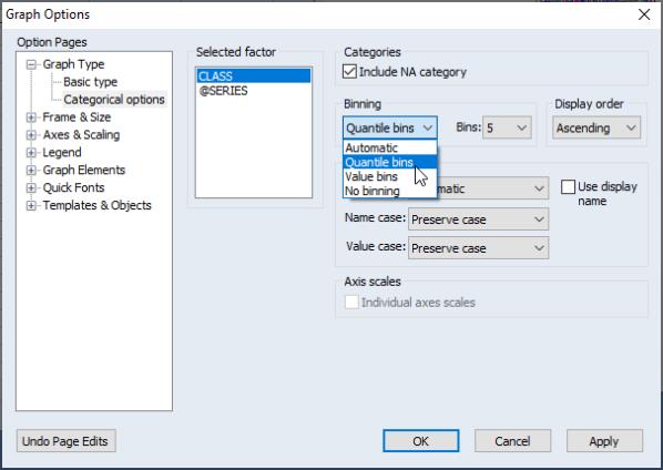
By default, EViews tries to avoid this situation by analyzing each factor to determine whether it appears to be categorical or continuous. If EViews determines that the variable is continuous, or if there is a large number of categories associated with the factor, EViews will define a new categorization by automatically binning the factor into five categories defined by the quintiles of the series.
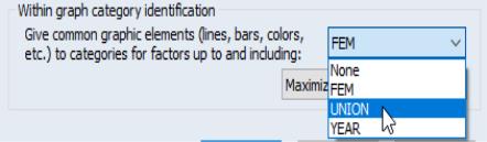
You may override the EViews default categorization settings using the dialog under the section (note that this dialog is only available when has been selected for the ) and a within or between factor has been provided. Simply select the factor whose options you wish to change in the left-side list box, then select the desired entry in the dropdown menu. The default setting, , uses if there are a large number of distinct values for the factor, and otherwise. You may choose either of the latter two methods directly, or tell EViews to create by grouping data on the basis of equal width intervals. For both and , EViews will prompt you for the number of bins to use. The default number of bins is 5.
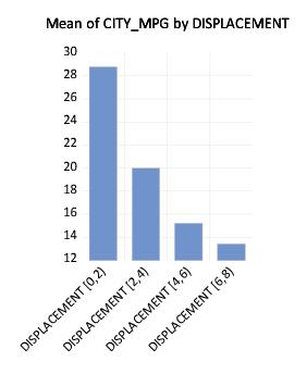
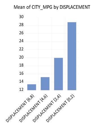
For example, we again consider the workfile “Mpg.WF1” which reports EPA reported miles-per-gallon and engine size (displacement) for 468 automobiles. We first display the categorical bar graph of the mean of CITY_MPG using the categorical variable DISPLACEMENT as a within factor.
There are 35 distinct values in the DISPLACEMENT series. EViews automatic binning settings allow DISPLACEMENT to be used as an unbinned factor so that by default, EViews attempts to label all 35 categories in the resulting graph. The graph may be a bit busy for most tastes, even if we only change the labeling to show the factor levels and not the series name. One alternative is to display a binned version of this graph where we define categories based on intervals of the DISPLACEMENT values.
Click on under in the main dialog, select DISPLACEMENT in the left-hand side list box, then change the dropdown to . For these settings, EViews will create a factor using (at most) 5 equal-width bins based on the values of DISPLACEMENT. Click on to accept the options.
The resulting graph shows that EViews categorizes observations into one of four DISPLACEMENT ranges: [0, 2), [2, 4), [4, 6), [6, 8). The mean MPG for cars with engine size under 2 liters is roughly 29, while the mean value for engines from 6 to 8 liters is under 14. While the negative relationship between engine size and miles-per-gallon can be seen in the earlier graph, it is more apparent in the binned version.
It is worth noting that binning on the basis of custom thresholds is not directly supported in graphs. If you wish to define custom bins, you should use the series classification Proc to define a new categorical variable (see
“Stats by Classification” for details), and then use the new variable as your factor.
Factor Display Settings
Having defined factor categories for one or more factors, there are several basic settings that will control the appearance of your graph: whether to display factor levels within or across graph frames, the ordering of factor levels, the ordering of multiple factors, and for summary graphs, the assignment of graph elements to factor levels and the method of labeling factor categories.
Within vs. Across
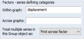
You should enter your factor names in the and edit lists on the main graph options page. Each level of a factor entered in the factor list will be displayed in a separate graph frame, while levels of factors in will be displayed in single frames.
In addition, if you are plotting multiple series in a group, you will be prompted for whether to treat the different series as an across or a within factor, and to specify the factor ordering (whether the factor should be placed at the beginning or end of the list).
A number of the case studies in
“Illustrative Examples” demonstrate the effects of these choices.
Factor Levels Ordering
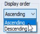
By default, EViews orders the categories formed from each factor from lowest to highest value. Categories formed from numeric values will be sorted numerically while categories formed from alphanumeric factors will be sorted alphabetically. The order of categories is then used in constructing the graph.
To change the ordering of levels for a given factor, click on to display the options dialog, select a factor in the left-hand side list box, then change the dropdown from the default to .
We may, for example, modify our categorical graph for CITY_MPG using the binned values of DISPLACEMENT. Double click on the graph to open the main graph dialog, click on to show the options dialog, and change the display order.
Note that changing the ordering of the levels changes the order in which they are displayed in the graph. The categories for DISPLACEMENT now start at the largest level for the factor and continue on through the smallest.
Multiple Factor Ordering
You may specify more than one factor variable, thereby forming a set of categories defined by each combination of the distinct factor values. In this case, the order in which the factors vary has an important effect on the final display.
Suppose, in addition to the FEM variable, you have a second factor variable UNION representing whether the individual is in “Union” or “Non-union” employment. Then the four categories for these two factors are: {(“Male,” “Non-union”), (“Male,” “Union”), (“Female,” “Non-union”), (“Female,” “Union”)}.
Note that in this list, we have arranged these factors so that:
Order | FEM | UNION |
1 | “Male” | “Non-union” |
2 | “Male” | “Union” |
3 | “Female” | “Non-union” |
4 | “Female” | “Union” |
with the “Male” categories coming first, followed by the “Female” categories, and with the UNION status categories varying within the FEM categories. We say that the FEM factor varies more slowly in this ordering than the UNION category since the latter varies within each level of FEM.
Alternately, we can reverse the ordering so that the FEM factor varies more rapidly:
Order | FEM | UNION |
1 | “Male” | “Non-union” |
2 | “Female” | “Non-union” |
3 | “Male” | “Union” |
4 | “Female” | “Union” |
so that the GENDER values vary for each level of UNION.
We may extend this notion of ordering to more than two categories. Suppose we have a third factor, YEAR, representing the year the individual is observed, with three distinct values 1980, 1981, and 1982. Then if FEM varies most slowly, UNION next most slowly, and YEAR most rapidly, we have:
Order | FEM | UNION | YEAR |
1 | “Male” | “Non-union” | 1980 |
2 | “Male” | “Non-union” | 1981 |
3 | “Male” | “Non-union” | 1982 |
4 | “Male” | “Union” | 1980 |
5 | “Male” | “Union” | 1981 |
6 | “Male” | “Union” | 1982 |
7 | “Female” | “Non-union” | 1980 |
8 | “Female” | “Non-union” | 1981 |
9 | “Female” | “Non-union” | 1982 |
10 | “Female” | “Union” | 1980 |
11 | “Female” | “Union” | 1981 |
12 | “Female” | “Union” | 1982 |
The first three cells correspond to {“Male,” “Non-union”} workers in each of the three years, while the first six cells correspond to the “Male” workers for both union and non-union workers in each of the three years.
When specifying factors in the main page, you will enter the factors in the or list. Within each list, factors should be ordered from slowest to fastest varying. Factors listed in the list are always more slowly varying than those in the list since each across graph category is displayed in a separate graph frame.
The first example in this section uses the ordering:
fem union
so that FEM varies more slowly than UNION. The second example reverses the ordering of the two factors so that UNION varies more slowly:
union fem
The last example orders the factors so that FEM varies most slowly, and YEAR most rapidly:
fem union year
Various examples of the effect of reversing the ordering of factors are provided in
“Illustrative Examples”.
Assigning Graph Elements to Categories
One of the most important decisions you will make a within categorical summary graph is choosing the elements for displaying data for different categories. While EViews provides you with reasonable defaults, there are useful features for customizing these choices that you may find useful.
(The choices described in this section are not relevant for non-summary categorical graphs specified by selecting in the dropdown on the main graph dialog).
To understand the basic issues involved in these choosing graph elements, we must first divide our within factors into two groups: primary and secondary factors. Primary within factors are a subset of most slowly moving factors whose levels share common graph elements (e.g., colors, line patterns, shades). The remaining secondary factors display different levels with different graphic elements.
You may think of the primary factors as defining the set of categories that yield summary “observations” so that they are arrayed along the axis, with the secondary factors defining subsets within these categories (much in the same way that one may draw minor ticks between the major ticks on a graph axis). We then apply the general rule that primary factors share common graph elements across levels, while secondary factors use different graph elements for different categories. The interpretation of primary factors as being categories displayed the axis with secondary factors specified as subsets of the primary factors is an important one that we will explore further.
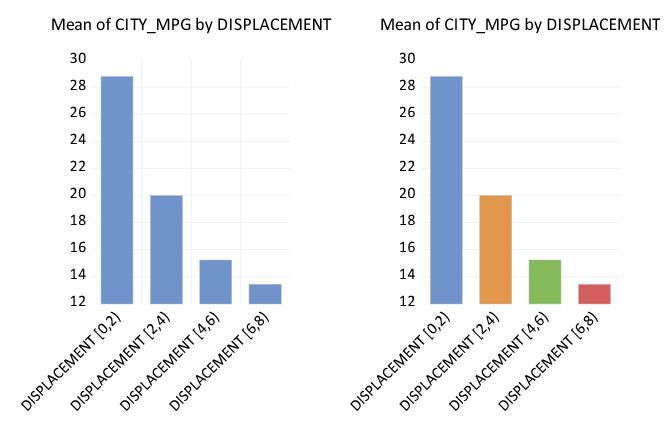
As is often the case, some examples will best illustrate the basic ideas. We return to the earlier example of constructing a binned categorical graph for mean of CITY_MPG divided into ranges of DISPLACEMENT. We begin by displaying a bar graph showing the categorical means:
On the left is the graph using default settings where DISPLACMENT is treated as a primary factor, while on the right is a graph with DISPLACMENT treated as a secondary factor. Note that on the left, the levels of the primary factor DISPLACEMENT use the same graph element (bar color), while on the right, the levels of the secondary factor DISPLACEMENT use different bar colors.
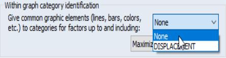
Before examining examples of the more complex settings, let us first see how we modify the default settings of the graph on the left to obtain the graph on the right. Click on to display the options dialog. At the bottom of the dialog is the descriptively titled which provides control over the assignment to major and minor factor categories, and as we will see later, the labeling of these categories.
As the name suggests, the verbosely labeled dropdown menu , selects the set of factors are to be given common graphic elements. Since the primary factors must be the most slowly varying factors, assigning factors to the primary and secondary groups is the same as choosing a cutoff such that factors up to and including the cutoff are primary factors, and factors following the cutoff are secondary factors.
In the single factor case setting, the dropdown default is set so that factor is primary so that all graph elements are common; in this example, the dropdown is set to . The graph above on the left, with all bars displayed using the same color, shows the default setting. Changing the dropdown to read indicates that there are no primary factor, only the single secondary factor, as in the graph with different colored bars on the right.
While informative, our bar graph example hides one very important difference between the two graphs. Recall that one interpretation of the difference between primary and secondary factors is that the levels of the primary factors are placed along the axis, with secondary factors defining subsets within these major categories. In our example, there are four distinct categories along the axis in the left bar graph and only one category on the axis in the right graph. The different numbers of categories along the axis is hidden in bar graphs; since the latter always offset bars drawn for different categories it is difficult to tell the difference between the primary and secondary factor categories.
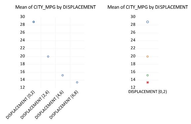
We may, see the importance of this difference when switching from a bar graph to a dot plot:
In the graph on the left, DISPLACEMENT is a primary factor so that each level of the factor is displayed as a separate “observation” along the axis using a common symbol and color for the dot. In the graph on the right, DISPLACEMENT is a secondary factor that is displayed using different symbols and colors for each level of the primary factor. Since there is no primary factor in this case there is only a single observation on the axis, and all four symbols are lined up on that single observation.
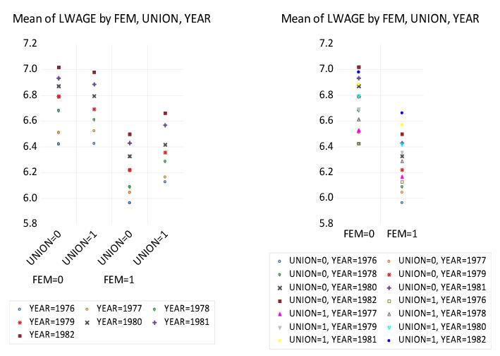
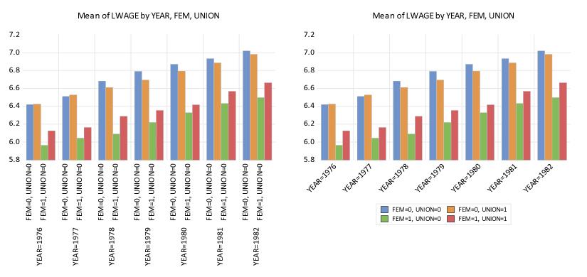
For a slightly more complicated example, we again use the “Wages.WF1” workfile containing information on log wages for a sample of 4165 individuals. We will use the three series FEM, UNION, and YEAR as within factors, entered in that order, and will display a dot plot of the means for this categorization using the default settings.
For more than one within factor, the default is to designate only the last listed factor as a secondary factor. At the default setting, the dropdown menu in our example is set to so that FEM and UNION are primary factors for the graph, while YEAR is as secondary factor.
The resulting graph, shown on the left, has several notable features. First, the four distinct categories formed from the primary factors FEM and UNION are each assigned to the graph axis. Within each level of the primary factors, we see distinct symbols representing the various levels of the secondary YEAR factor. Lastly, the set of symbols is common across primary factor levels (e.g., all four of the “YEAR=1976” symbols are blue circles).
Changing the dropdown menu to FEM produces the graph on the right. Since FEM is the sole primary factor, EViews assigns the two levels for FEM to the graph axis, with the remaining factors treated as secondary factors.
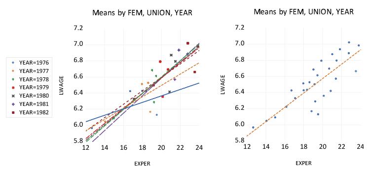
For our next example, we consider the group object GROUP01 containing the series EXPER and LWAGE. We display scatterplots of the categorical means for these two series given the three within factors FEM, UNION, and YEAR, along with regression fit lines.
The scatterplot on the left uses the default setting so that FEM and UNION are primary categories, and YEAR is a secondary category. Mean values are plotted for each category, with different symbols used for different levels of YEAR. Following the principal that primary factors define observations, regression fit lines are computed for each level of the secondary category across levels of the primary factor. Thus, the fit line for YEAR=1977 shows the regression fit obtained using the four mean values of LWAGE and EXPER in the categories defined by levels of FEM and UNION.
In contrast, setting the dropdown to YEAR so that all factors are primary yields the plot on the right. All of the points use the common symbols, and the fit line is fitted across all of the primary factor levels.
The basic principle here is that if you wish to draw fit lines for summary statistics across categories, those categories should be specified as primary factors.
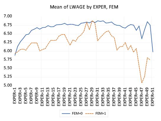
Parenthetically, we are now in a position to explain the apparently anomalous ordering of factors in our wage-experience profiles above (
“Line Graphs”). Recall that the displaying separate average wage-experience profiles for men and women in a single graph frame required that we use the within factor list “EXPER FEM” despite the fact that EXPER appears to vary more rapidly that FEM.
\
An examination of the default settings for the graph reveals that EXPER is a primary factor, while FEM is a secondary factor. Since the levels of EXPER are observation identifiers that are displayed along the axis, line graphs connect the EXPER levels, making it appear that EXPER varies rapidly, even though the points are with FEM varying for each level of EXPER.
Here, we see the dot plot corresponding to the earlier line graph. FEM clearly varies more rapidly as both the FEM=0 and FEM=1 points are plotted for each level of EXPER. The line graph version of this graph simply connect points across observations (experience levels) for each level of FEM and turns off the symbols, making it appear as though EXPER is varying more rapidly.
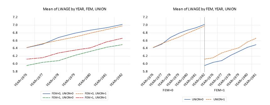
Our last example ties together all of the various concepts. Suppose that we were to plot the average log wage against year using FEM and UNION as our factors. There are two distinct approaches to constructing this graph. In the first approach, we specify a single observation scale using YEAR and draw four different wage-year profiles, one for each category formed by FEM and UNION. In the second approach, we adopt a “panel” style graph in which divide the factor scale into two panels, with the first panel representing a YEAR scale for males, and the second panel representing a YEAR scale for females. We show the two cases below:
The graph on the left specifies the within factor list as “YEAR FEM UNION”, with YEAR the sole primary factor, and FEM and UNION the secondary factors. The axis scale uses YEAR to identify observations, and for each secondary factor category draws a line connecting the observations for that category. In contrast, the graph on the right uses the within factor list “FEM YEAR UNION”, with FEM and YEAR as the primary factors. The axis scale uses FEM and YEAR for observations, with YEAR varying for each level of FEM, and for each level of the secondary factor connects the lines across the observations for each factor. Note that EViews knows not to connect lines across levels of the FEM factor.
(Note: we have customized the graph on the right slightly by freezing the graph, and turning on in the section of the page.
The rule-of-thumb to remember here is that the factor that you wish to connect using a line graph or XY line graph, should be specified as the last primary factor. Specifications with one primary factor will have a set of lines for each secondary factor factory; specifications with more than one primary factor will be displayed in paneled form.
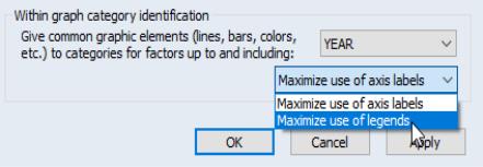
Factor Labeling
By default, EViews will label factor levels in summary graphs using some combination of axis labels and legend entries. For line graphs and XY graphs, the EViews choices are the only possible way to identify the levels. For other types of summaries, we may choose to display the bulk of the label information along the axis, or we may choose to display most of the information in legend entries.
Both of the graphs displayed here are summary bar graphs of LWAGE categorized by YEAR, FEM and UNION. In the graph on the left, we display all of the category information using two-level labels along the axis, while in the graph on the right, we display the information using a single level axis label combined with legend entries.
By default, EViews will, if possible, place the category information along the axis. You may choose to override this default using the dialog. At the bottom of the options dialog, in the section, there is a dropdown menu which allows you to choose between the default, , or the alternative, , which encourages the use of legend information. The graph on the left above was obtained using the default setting, while the graph on the right was obtained by encouraging the use of legend information.
We emphasize again that this dropdown menu does not affect the category labeling for Line & Symbol, Scatter, and XY Line plots.