Customizing a Graph
EViews provides a wide range of tools for customizing the appearance of a named graph object. Nearly every display characteristic of the graph may be modified, including the appearance of lines and filled areas, legend characteristics and placement, frame size and attributes, and axis settings. In addition, you may add text labels, lines, and shading to the graph.
You may modify the appearance of a graph using dialogs or via the set of commands described below. Note that the commands are only available for graph objects since they take the form of graph procedures.
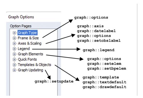
An overview of the relationship between the tabs of the graph dialog and the associated graph commands is illustrated below:
Line characteristics
For each data line in a graph, you may modify color, width, pattern and symbol using the
Graph::setelem command. Follow the command keyword with an integer representing the data element in the graph you would like to modify, and one or more keywords for the characteristic you wish to change. List of symbol and pattern keywords, color keywords, and RGB settings are provided in
Graph::setelem.
To modify line color and width you should use the lcolor and lwidth keywords:
graph gr1.line ser1 ser2 ser3
gr1.setelem(3) lcolor(orange) lwidth(2)
gr1.setelem(3) lcolor(255, 128, 0) lwidth(2)
The first command creates a line graph GR1 with colors and widths taken from the global defaults, while the latter two commands equivalently change the graph element for the third series to an orange line 2 points wide.
Each data line in a graph may be drawn with a line, symbols, or both line and symbols. The drawing default is given by the global options, but you may elect to add lines or symbols using the lpattern or symbol keywords.
To add circular symbols to the line for element 3, you may enter:
gr1.setelem(3) symbol(circle)
Note that this operation modifies the existing options for the symbols, but that the line type, color and width settings from the original graph will remain. To return to line only or symbol only in a graph in which both lines and symbols are displayed, you may turn off either symbols or patterns, respectively, by using the “none” type:
gr1.setelem(3) lpat(none)
or
gr1.setelem(3) symbol(none)
The first example removes the line from the drawing for the third series, so only the circular symbol is used. The second example removes the symbol, so only the line is used.
If you attempt to remove the lines or symbols from a graph element that contains only lines or symbols, respectively, the graph will change to show the opposite type. For example:
gr1.setelem(3) lpat(dash2) symbol(circle)
gr1.setelem(3) symbol(none)
gr1.setelem(3) lpat(none)
initially represents element 3 with both lines and symbols, then turns off symbols for element 3 so that it is displayed as lines only, and finally shows element 3 as symbols only, since the final command turns off lines in a line-only graph.
The examples above describe customization of the basic elements common to most graph types.
“Modifying Boxplots” provides additional discussion of
Graph::setelem options for customizing boxplot data elements.
Use of color with lines and filled areas
By default, EViews automatically formats graphs to accommodate output in either color or black and white. When a graph is sent to a printer or saved to a file in black and white, EViews translates the colored lines and fills seen on the screen into an appropriate black and white representation. The black and white lines are drawn with line patterns, and fills are drawn with gray shading. Thus, the appearance of lines and fills on the screen may differ from what is printed in black and white (this color translation does not apply to boxplots).
You may override this auto choice display method by changing the global defaults for graphs. You may choose, for example, to display all lines and fills as patterns and gray shades, respectively, whether the graph uses color or not. All subsequently created graphs will use the new settings.
Alternatively, if you would like to override the color, line pattern, and fill settings for a given graph object, you may use the
Graph::options graph proc.
Color
To change the color setting for an existing graph object, you should use options with the color keyword. If you wish to turn off color altogether for all lines and filled areas, you should precede the keyword with a negative sign, as in:
gr1.options -color
To turn on color, you may use the same command with the “-” omitted.
Lines and patterns
To always display solid lines in your graph, irrespective of the color setting, you should use options with the linesolid keyword. For example:
gr1.options linesolid
sets graph GR1 to use solid lines when rendering on the screen in color and when printing, even if the graph is printed in black and white. Note that this setting may make identification of individual lines difficult in a printed black and white graph, unless you change the widths or symbols associated with individual lines (see
“Line characteristics”).
Conversely, you may use the linepat option to use patterned lines regardless of the color setting:
gr1.options linepat
One advantage of using the
linepat option is that it allows you to see the pattern types that will be used in black and white printing without turning off color in your graph. For example, using the
Graph::setelem command again, change the line pattern of the second series in GR1 to a dashed line:
gr1.setelem(2) lpat(dash1)
This command will not change the appearance of the colored lines on the screen if color is turned on and auto choice of line and fill type is set. Thus, the line will remain solid, and the pattern will not be visible until the graph is printed in black and white. To view the corresponding patterns, either turn off color so all lines are drawn as black patterned lines, or use the linepat setting to force patterns.
To reset the graph or to override modified global settings so that the graph uses auto choice, you may use the lineauto keyword:
gr1.options lineauto
This setting instructs the graph to use solid lines when drawing in color, and use line patterns and gray shades when drawing in black and white.
Note that regardless of the color or line pattern settings, you may always view the selected line patterns in the section of the graph options dialog. The dialog can be brought up interactively by double clicking anywhere in the graph.
Filled area characteristics
You can modify the color, gray shade, and hatch pattern of each filled area in a bar, area, or pie graph.
To modify these settings, use
Graph::setelem, followed by an integer representing the data element in the graph you would like to modify, and a keyword for the characteristic you wish to change. For example, consider the commands:
graph mygraph.area(s) series1 series2 series3
mygraph.setelem(1) fcolor(blue) hatch(fdiagonal) gray(6)
mygraph.setelem(1) fcolor(0, 0, 255) hatch(fdiagonal) gray(6)
The first command creates MYGRAPH, a stacked area graph of SERIES1, SERIES2, and SERIES3. The latter two commands are equivalent, modifying the first series by setting its fill color to blue with a forward diagonal hatch. If MYGRAPH is viewed without color, the area will appear with a hatched gray shade of index 6.
See
Graph::setelem for a list of available color keywords, and for gray shade indexes and available hatch keywords. Note that changes to gray shades will not be visible in the graph unless color is turned off.
Using preset lines and fills
For your convenience, EViews provides you with a collection of preset line and fill characteristics. Each line preset defines a color, width, pattern, and symbol for a line, and each fill preset defines a color, gray shade, and hatch pattern for a fill. There are thirty line and thirty fill presets.
The global graph options are initially set to use the EViews preset settings. These global options are used when you first create a graph, providing a different appearance for each line or fill. The first line preset is applied to the first data line, the second preset is applied to the second data line, and so on. If your graph contains more than thirty lines or fills, the presets are simply reused in order.
You may customize the graph defaults in the global dialog. Your settings will replace the existing EViews defaults, and will be applied to all graphs created in the future.
EViews allows you to use either the original EViews presets, or those you have specified in the global dialog when setting the characteristics of an existing graph. The keyword preset is used to indicate that you should use the set of options from the corresponding EViews preset; the keyword default is used to indicate that you should use the set of options from the corresponding global graph element defaults.
For example:
mygraph.setelem(2) preset(3)
allows the second fill area in MYGRAPH to use the original EViews presets for a third fill area. In current versions of EViews, these settings include a green fill, a medium gray shade of 8, and no hatch.
Alternatively:
mygraph.setelem(2) default(3)
also changes the second area of MYGRAPH, but uses the third set of user-defined presets. If you have not yet modified your global graph defaults, the two commands will yield identical results.
When using the
preset or
default keywords with boxplots, the line color of the specified preset will be applied to all boxes, whiskers, and staples in the graph. See
“Modifying Boxplots” for additional information.
Scaling and axes
There are four commands that may be used to modify the axis and scaling characteristics of your graphs:
• First, the
Graph::setelem command with the
axis keyword may be used to assign data elements to different axes.
• Second, the
Graph::axis command can be used to customize the appearance of any axes in the graph object. You may employ the
axis command to modify the scaling of the data itself, for example, as when you use a logarithmic scale, or to alter the scaling of the axis, as when you enable dual scaling. The
axis command may also be used to change the appearance of axes, such as to modify tick marks, change the font size of axis labels, turn on grid or zero lines, or duplicate axes.
• Third, the
Graph::datelabel command modifies the labeling of the bottom date/time axis in time plots. Use this command to change the way date labels are formatted or to specify label frequency.
• Finally, the
Graph::setobslabel command may be used to create custom axis labels for the observation scale of a graph.
Assigning data to an axis
In most cases, when a graph is created, all data elements are initially assigned to the left axis. XY graphs differ slightly in that data elements are initially assigned to either the left or bottom axis.
Once a graph is created, individual elements may generally be assigned to either the left or right axis. In XY graphs, you may reassign individual elements to either the left, right, top, or bottom axis, while in boxplots or stacked time/observation graphs all data elements must be assigned to the same vertical axis.
To assign a data element to a different axis, use the setelem command with the axis keyword. For example, the commands:
graph graph02.line ser1 ser2
graph02.setelem(2) axis(right)
first create GRAPH02, a line graph of SER1 and SER2, and then turn GRAPH02 into a dual scaled graph by assigning the second data element, SER2, to the right axis.
In this example, GRAPH02 uses the default setting for dual scale graphs by disallowing crossing, so that the left and right scales do not overlap. To allow the scales to overlap, use the axis command with the overlap keyword, as in:
graph02.axis overlap
The left and right scales now span the entire axes, allowing the data lines to cross. To reverse this action and disallow crossing, use -overlap, (the overlap keyword preceded by a minus sign, “–”).
For XY graphs without pairing, the first series is generally plotted along the bottom axis, and the remaining series are plotted on the left axis. XY graphs allow more manipulation than time/observation plots, because the top and bottom axes may also be assigned to an element. For example:
graph graph03.xyline s1 s2 s3 s4
graph03.setelem(1) axis(top)
graph03.setelem(2) axis(right)
first creates an XY line graph GRAPH03 of the series S1, S2, S3, and S4. The first series is then assigned to the top axis, and the second series is moved to the right axis. Note that the graph now uses three axes: top, left, and right.
Note that the element index in the setelem command is not necessary for boxplots and stacked time/observation graphs, since all data elements must be assigned to the same vertical axis.
While EViews allows dual scaling for the vertical axes in most graph types, the horizontal axes must use a single scale on either the top or bottom axis. When a new element is moved to or from one of the horizontal axes, EViews will, if necessary, reassign elements as required so that there is a single horizontal scale.
For example, using the graph created above, the command:
graph03.setelem(3) axis(bottom)
moves the third series to the bottom axis, forcing the first series to be reassigned from the top to the left axis. If you then issue the command:
graph03.setelem(3) axis(right)
EViews will assign the third series to the right axis as directed, with the first (next available element, starting with the first) series taking its place on the horizontal bottom axis. If the first element is subsequently moved to a vertical axis, the second element will take its place on the horizontal axis, and so forth. Note that series will never be reassigned to the right or top axis, so that series that placed on the top or right axis and subsequently reassigned will not be replaced automatically.
For XY graphs with pairing, the same principles apply. However, since the elements are graphed in pairs, there is a set of elements that should be assigned to the same horizontal axis. You can switch which set is assigned to the horizontal using the axis keyword. For example:
graph graph04.xypair s1 s2 s3 s4
graph03.setelem(1) axis(left)
creates an XY graph that plots the series S1 against S2, and S3 against S4. Usually, the default settings assign the first and third series to the bottom axis, and the second and fourth series to the left axis. The second command line moves the first series (S1) from the bottom to the left axis. Since S1 and S3 are tied to the same axis, the S3 series will also be assigned to the left axis. The second and fourth series (S2 and S4) will take their place on the bottom axis.
Modifying the data axis
The
Graph::axis command may be used to change the way data is scaled on an axis. To rescale the data, specify the axis you wish to change and use one of the following keywords:
linear,
linearzero (linear with zero included in axis),
log (logarithmic),
norm (standardized). For example:
graph graph05.line ser1 ser2
graph05.axis(left) log
creates a line graph GRAPH05 of the series SER1 and SER2, and changes the left axis scaling method to logarithmic.
The interaction of the data scales (these are the left and right axes for non-XY graphs) can be controlled using axis with the overlap keyword. The overlap keyword controls the overlap of vertical scales, where each scale has at least one series assigned to it. For instance:
graph graph06.line s1 s2
graph06.setelem(2) axis(right)
graph06.axis overlap
first creates GRAPH06, a line graph of series S1 and S2, and assigns the second series to the right axis. The last command allows the vertical scales to overlap.
The axis command may also be used to change or invert the endpoints of the data scale, using the range or invert keywords:
graph05.axis(left) -invert range(minmax)
inverts the left scale of GRAPH05 (“–” indicates an inverted scale) and sets its endpoints to the minimum and maximum values of the data.
Modifying the date/time axis
EViews automatically determines an optimal set of labels for the bottom axis of time plots. If you wish to modify the frequency or date format of the labels, you should use the
Graph::datelabel command. Alternately, to create editable labels on the observation scale, use the
Graph::setobslabel command.
To control the number of observations between labels, use datelabel with the interval keyword to specify a desired step size. The stand-alone step size keywords include: auto (use EViews' default method for determining step size), ends (label first and last observations), and all (label every observation). For example,
mygraph.datelabel interval(ends)
labels only the endpoints of MYGRAPH. You may also use a step size keyword in conjunction with a step number to further control the labeling. These step size keywords include: obs (one observation), year (one year), m (one month), and q (one quarter), where each keyword determines the units of the number specified in the step keyword. For example, to label every ten years, you may specify:
mygraph.datelabel interval(year, 10)
In addition to specifying the space between labels, you may indicate a specific observation to receive a label. The step increment will then center around this observation. For example:
mygraph.datelabel interval(obs, 10, 25)
labels every tenth observation, centered around the twenty-fifth observation.
You may also use datelabel to modify the format of the dates or change their placement on the axis. Using the format or span keywords,
mygraph02.datelabel format(yy) -span
formats the labels so that they display as two digit years, and disables interval spanning. If interval spanning is enabled, labels will be centered between the applicable tick marks. If spanning is disabled, labels are placed directly on the tick marks. For instance, in a plot of monthly data with annual labeling, the labels may be centered over the twelve monthly ticks (spanning enabled) or placed on the annual tick marks (spanning disabled).
If your axis labels require further customization, you may use the setobslabel command to create a set of custom labels.
mygraph.setobslabel(current) "CA" "OR" "WA"
creates a set of axis labels, initializing each with the date or observation number and assigns the labels “CA”, “OR”, and “WA” to the first three observations.
To return to EViews automatic labeling, you may use the clear option:
mygraph.setobslabel(clear)
Customizing axis appearance
You may customize the appearance of tick marks, modify label font size, add grid lines, or duplicate axes labeling in your graph using
Graph::axis.
Follow the axis keyword with a descriptor of the axis you wish to modify and one or more arguments. For instance, using the ticksin, minor, and font keywords:
mygraph.axis(left) ticksin -minor font(10)
The left axis of MYGRAPH is now drawn with the tick marks inside the graph, no minor ticks, and a label font size of 10 point.
To add lines to a graph, use the grid or zeroline keywords:
mygraph01.axis(left) -label grid zeroline
MYGRAPH01 hides the labels on its left axis, draws horizontal grid lines at the major ticks, and draws a line through zero on the left scale.
In single scale graphs, it is sometimes desirable to display the axis labels on both the left and right hand sides of the graph. The mirror keyword may be used to turn on or off the display of duplicate axes. For example:
graph graph06.line s1 s2
graph06.axis mirror
creates a line graph with both series assigned to the left axis (the default assignment), then turns on mirroring of the left axis to the right axis of the graph. Note that in the latter command, you need not specify an axis to modify, since mirroring sets both the left and right axes to be the same.
If dual scaling is enabled, mirroring will be overridden. In our example, assigning a data element to the right axis:
graph06.setelem(1) axis(right)
will override axis mirroring. Note that if element 1 is subsequently reassigned to the left scale, mirroring will again be enabled. To turn off mirroring entirely, simply precede the mirror keyword with a minus sign. The command:
graph06.axis -mirror
turns off axis mirroring.
Customizing the graph frame
The graph frame is used to set the basic graph proportions and display characteristics that are not part of the main portion of the graph.
Graph size
The graph frame size and proportions may be modified using the
Graph::options command. Simply specify a width and height using the
size keyword. For example:
testgraph.options size(5,4)
resizes the frame of TESTGRAPH to

virtual inches.
Other frame characteristics
The
Graph::options command may also be used to modify the appearance of the graph area and the graph frame. A variety of modifications are possible.
First, you may change the background colors in your graph, by using the “fillcolor” and “backcolor” keywords to change the frame fill color and the graph background color, respectively. The graph proc command:
testgraph.options fillcolor(gray) backcolor(white)
fills the graph frame with gray, and sets the graph area background color to white. Here we use the predefined color settings (“blue,” “red,” “ltred”, “green,” “black,” “white,” “purple,” “orange,” “yellow,” “gray,” “ltgray”); alternately, you may specify “color” with three arguments corresponding to the respective RGB settings.
You may control display of axes frames. To select which axes should have a frame, you should use the “frameaxes” keyword:
testgraph.options frameaxes(labeled)
which turns off the frame on any axis which is not associated with data. Similarly:
testgraph.options frameaxes(lb)
draws a frame on the left and bottom axes only.
By default, EViews uses the entire width of the graph for plotting data. If you wish to indent the data display from the edges of the graph frame, you should use the “indenth” (indent horizontal) or “indentv” (indent vertical) keywords:
testgraph.options indenth(.05) indentv(0.1)
indents the data by 0.05 inches horizontally, and 0.10 inches vertically from the edge of the graph frame.
The options command also allows you to add and modify grid lines in your graph. For example:
testgraph.options gridb -gridl gridpat(dash2) gridcolor(red)
turns on dashed, red, vertical gridlines from the bottom axis, while turning off left scale gridlines.
Labeling data values
Bar and pie graphs allow you to label the value of your data within the graph. Use the
Graph::options command with one of the following keywords:
barlabelabove,
barlabelinside, or
pielabel. For example:
mybargraph.options barlabelabove
places a label above each bar in the graph indicating its data value. Note that the label will be visible only when there is sufficient space in the graph.
Outlining and spacing filled areas
EViews draws a black outline around each bar or area in a bar or area graph, respectively. To disable the outline, use options with the outlinebars or outlineareas keyword:
mybargraph.options -outlinebars
Disabling the outline is useful for graphs whose bars are spaced closely together, enabling you to see the fill color instead of an abundance of black outlines.
EViews attempts to place a space between each bar in a bar graph. This space disappears as the number of bars increases. You may remove the space between bars by using the barspace keyword:
mybargraph.options -barspace
Modifying the Legend
A legend's location, text, and appearance may be customized. Note that single series graphs and special graph types such as boxplots and histograms use text objects for labeling instead of a legend. These text objects may only be modified interactively by double-clicking on the object to bring up the text edit dialog.
To change the text string of a data element for use in the legend, use the
Graph::name command:
graph graph06.line ser1 ser2
graph06.name(1) Unemployment
graph06.name(2) DMR
The first line creates a line graph GRAPH06 of the series SER1 and SER2. Initially, the legend shows “SER1” and “SER2”. The second and third command lines change the text in the legend to “Unemployment” and “DMR”.
Note that the
name command is equivalent to using the
Graph::setelem command with the
legend keyword. For instance,
graph06.setelem(1) legend(Unemployment)
graph06.setelem(2) legend(DMR)
produces the same results.
To remove a label from the legend, you may use name without providing a text string:
graph06.name(2)
removes the second label “DMR” from the legend.
For an XY graph, the name command modifies any data elements that appear as axis labels, in addition to legend text. For example:
graph xygraph.xy ser1 ser2 ser3 ser4
xygraph.name(1) Age
xygraph.name(2) Height
creates an XY graph named XYGRAPH of the four series SER1, SER2, SER3, and SER4. “SER1” appears as a horizontal axis label, while “SER2,” “SER3,” and “SER4” appear in the legend. The second command line changes the horizontal label of the first series to “Age”. The third line changes the second series label in the legend to “Height”.
To modify characteristics of the legend itself, use
Graph::legend. Some of the primary options may be set using the
inbox,
position and
columns keywords. Consider, for example, the commands:
graph graph07.line s1 s2 s3 s4
graph07.legend -inbox position(botleft) columns(4)
The first line creates a line graph of the four series S1, S2, S3, and S4. The second line removes the box around the legend, positions the legend in the bottom left corner of the graph window, and specifies that four columns should be used for the text strings of the legend.
When a graph is created, EViews automatically determines a suitable number of columns for the legend. A graph with four series, such as the one created above, would likely display two columns of two labels each. The columns command above, with an argument of four, creates a long and slender legend, with each of the four series in its own column.
You may also use the legend command to change the font size or to disable the legend completely:
graph07.legend font(10)
graph07.legend -display
Note that if the legend is hidden, any changes to the text or position of the legend remain, and will reappear if the legend is displayed again.
Adding text to the graph
Text strings can be placed anywhere within the graph window. Using the
Graph::addtext command:
graph07.addtext(t) Fig 1: Monthly GDP
adds the text “Fig 1: Monthly GDP” to the top of the GRAPH07 window. You can also use specific coordinates to specify the position of the upper left corner of the text. For example:
graph08.addtext(.2, .1, x) Figure 1
adds the text string “Figure 1” to GRAPH08. The text is placed 0.2 virtual inches in, and 0.1 virtual inches down from the top left corner of the graph frame. The “x” option instructs EViews to place the text inside a box.
An existing text object can be edited interactively by double-clicking on the object to bring up a text edit dialog. The object may be repositioned by specifying new coordinates in the dialog, or by simply dragging the object to its desired location.
Adding lines and shading
You may wish to highlight or separate specific areas of your graph by adding a line or shaded area to the interior of the graph using the
Graph::draw command. Specify the type of line or shade option (
line or
shade), which axis it should be attached to (
left,
right,
bottom,
top) and its position. For example:
graph09.draw(line, left) 5.2
draws a horizontal line at the value 5.2 on the left axis. Alternately:
graph09.draw(shade, left) 4.8 5.6
draws a shaded horizontal area bounded by the values 4.8 and 5.6 on the left axis. You can also specify color, line width, and line pattern:
graph09.draw(line, bottom, color(blue), width(2), pattern(3)) 1985:1
draws a vertical blue dashed line of width two points at the date “1985:1” on the bottom axis. Color may be specified using one or more of the following options: color(n1, n2, n3), where the arguments correspond to RGB settings, or color(keyword), where keyword is one of the predefined color keywords (“blue”, “red”, “ltred”, “green”, “black”, “white”, “purple”, “orange”, “yellow”, “gray”, “ltgray”).
Using graphs as templates
After customizing a graph as described above, you may wish to use your custom settings in another graph. Using a graph template allows you to copy the graph type, line and fill settings, axis scaling, legend attributes, and frame settings of one graph into another. This enables a graph to adopt all characteristics of another graph—everything but the data itself. To copy custom line or fill settings from the global graph options, use the
preset or
default keywords of the
Graph::setelem command (as described in
“Using preset lines and fills”).
Modifying an existing graph
To modify a named graph object, use the template command:
graph10.template customgraph
This command copies all the appearance attributes of CUSTOMGRAPH into GRAPH10.
To copy text labels, lines and shading in the template graph in addition to all other option settings, use the “t” option:
graph10.template(t) customgraph
This command copies any text or shading objects that were added to the template graph using the
Graph::addtext or
Graph::draw commands or the equivalent steps using dialogs. Note that using the “t” option overwrites any existing text and shading objects in the target graph.
Using a template during graph creation
All graph type commands also provide a template option for use when creating a new graph. For instance:
graph mygraph.line(o = customgraph) ser1 ser2
creates the graph MYGRAPH of the series SER1 and SER2, using CUSTOMGRAPH as a template. The “o” option instructs EViews to copy all but the text, lines, and shading of the template graph. To include these elements in the copy, use the “t” option in place of the “o” option.
When used as a graph procedure, this method is equivalent to the one described above for an existing graph, so that:
graph10.template(t) customgraph
graph10.bar(t = customgraph)
produce the same results.
Arranging multiple graphs
When you create a multiple graph, EViews automatically arranges the graphs within the graph window. (See
“Creating a Graph” for information on how to create a multiple graph.) You may use either the “m” option during graph creation or the
merge command.
To change the placement of the graphs, use the
Graph::align command. Specify the number of columns in which to place the graphs and the horizontal and vertical space between graphs, measured in virtual inches. For example:
graph graph11.merge graph01 graph02 graph03
graph11.align(2, 1, 1.5)
creates a multiple graph GRAPH11 of the graphs GRAPH01, GRAPH02, and GRAPH03. By default, the graphs are stacked in one column. The second command realigns the graphs in two columns, with 1 virtual inch between the graphs horizontally and 1.5 virtual inches between the graphs vertically.
Modifying Boxplots
The appearance of boxplots can be customized using many of the commands described above. A few special cases and additional commands are described below.
Customizing lines and symbols
As with other graph types, the
setelem command can be used with boxplots to modify line and symbol attributes, assign the boxes to an axis, and use preset and default settings. To use the
Graph::setelem command with boxplots, use a box element keyword after the command. For example:
boxgraph01.setelem(mean) symbol(circle)
changes the means in the boxplot BOXGRAPH01 to circles. Note that all boxes within a single graph have the same attributes, and changes to appearance are applied to all boxes. For instance:
boxgraph01.setelem(box) lcolor(orange) lpat(dash1) lwidth(2)
plots all boxes in BOXGRAPH01 with an orange dashed line of width 2 points. Also note that when shaded confidence intervals are used, a lightened version of the box color will be used for the shading. In this way, the above command also changes the confidence interval shading to a light orange.
Each element in a boxplot is represented by either a line or symbol. EViews will warn you if you attempt to modify an inappropriate option (e.g., modifying the symbol of the box).
Assigning boxes to an axis
The setelem command may also be used to assign the boxes to another axis:
boxgraph01.setelem axis(right)
Note that since all boxes are assigned to the same axis, the index argument specifying a graph element is not necessary.
Using preset line colors
During general graph creation, lines and fills take on the characteristics of the user-defined presets. When a boxplot is created, the first user-defined line color is applied to the boxes, whiskers, and staples. Similarly, when you use the
preset or
default keywords of the
setelem command with a boxplot, the line color of the preset is applied to the boxes, whiskers, and staples. (See
“Using preset lines and fills” for a description of presets.)
The preset and default methods work just as they do for other graph types, although only the line color is applied to the graph. For example:
boxgraph01.setelem default(3)
applies the line color of the third user-defined line preset to the boxes, whiskers, and staples of BOXGRAPH01. Note again that setelem does not require an argument specifying an index, since the selected preset will apply to all boxes.
There are a number of setelem arguments that do not apply to boxplots. The fillcolor, fillgray, and fillhatch option keywords are not available, as there are no custom areas to be filled. The legend keyword is also not applicable, as boxplots use axis text labels in place of a legend.
Hiding boxplot elements
In addition to the
setelem command, boxplots provide a
Graph::setbpelem command for use in enabling or disabling specific box elements. Any element of the boxplot can be hidden, except the box itself. Use the command with a list of box elements to show or hide. For example:
boxgraph01.setbpelem -mean far
hides the means and confirms that the far outliers are shown in BOXGRAPH01.
Modifying box width and confidence intervals
The width of the individual boxes in a boxplot can be drawn in three ways: fixed width over all boxes, proportional to the sample size, or proportional to the square root of the sample size. To specify one of these methods, use the setbpelem command with the width keyword, and one of the supported types (fixed, rootn, n). For example:
boxgraph01.setbpelem width(rootn)
draws the boxes in BOXGRAPH01 with widths proportional to the square root of their sample size.
There are three methods for displaying the confidence intervals in boxplots. They may be notched, shaded, or not drawn at all, which you may specify using one of the supported keywords (notch, shade, none). For example:
boxgraph01.setbpelem ci(notch)
draws the confidence intervals in BOXGRAPH01 as notches.